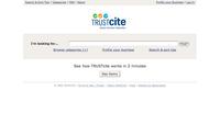
We’ve Googlized a client’s home page!
I’m usually of the mind that home pages should be rich with textual content so the search engines have something to sink their teeth into. In most cases it’s your home page that gets the most weight of all the pages of your site, so you don’t want to squander that opportunity. However, there are (rare) exceptions to this — times when another approach is in order — where you strip away all but the most essential components (sometimes all the way down to just a search box).
 This is referred to in some circles as “home page Googlization.” Usability guru Jared Spool recently blogged about home page Googlization. I pretty much agree with his take on this subject. However, we felt that the homepage of our client TrustCite was an exception that warranted Googlizing. The design is very minimalistic. Have a look at it. For this site, simplicity and responsiveness was of primary importance, because the site is meant to become a frequently used resource for New Zealanders. Its singular purpose is to help Kiwis find reputable tradespeople and service providers by relying on feedback from the user’s social network. The primary method of locating these suppliers is through the search box, although there are strong trigger words on the page tucked away under the “Browse categories [+]” link.
Other examples of sites where I think home page Googlization would be in order:
- Wikipedia (rarely are any of the trivia featured on the home page of interest to me, and never has this filler content been what I went to Wikipedia for)
- most bank homepages (all I care about as a customer is the online banking login form… take me to my money!)


